It is difficult to describe briefly all the innovations included in the new version of the Stagraph. Therefore, I will show you just a few screenshots with a description in this post. Later, we’re going to discuss the news in detail.
Redesigned was the basic application interface within the ribbon toolbar tab Home. This tab is divided into three sections. Using functions from the first section, you can add individual visual objects to your project. In previous versions, only one object type was available - Plot. Now you can add to your project up to 8 types of visual objects, such as Pairs Plot, Table, Text, Text Paragraph, Image, Grid Panel and Annotation. These objects can be used individually, or by its combination you may create compound, complex types of statistical graphics.

In the second section you will find functions for Dataset, Plot and R Console display. Finally, the last section provides data import tools and functions.
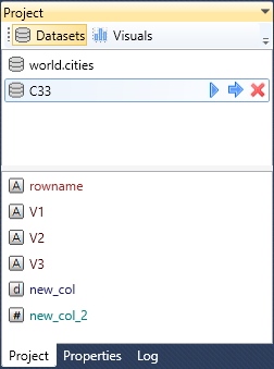
As in the previous version, the project is divided into two sections. The first section shows imported datasets. After clicking on the selected one, at the bottom of the panel are displayed its variables. Their color defines a variable type (e.g. brown for character, blue for date-time). The second section contains a list of created visual objects - visuals. In the previous version, you could work only with Plot objects. The 2.0 version allows you to work with several visual objects.

If you click on the selected dataset in the Project panel, a new ribbon toolbar tab appears - Data, where you will find functions for data cleaning, wrangling and statistical preprocessing.
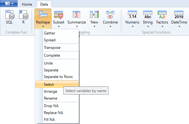
Functions are divided into logical groups. If you are working with the R language, from the picture you can recognize on which R packages the data wrangling in Stagraph is based on. These are packages from the tidyverse collection - dplyr, tidyr, lubridate, forcats and stringr
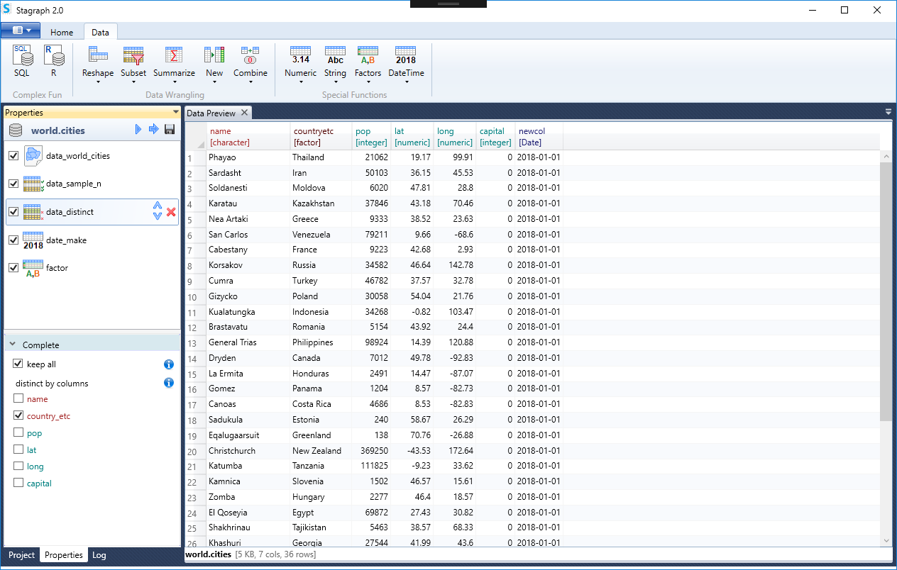
The data wrangling workflow was redesigned and visually is controllable in the same way as the plot definition. After clicking on the selected dataset in the Project panel, this is displayed in the second panel Properties, along with the individual functions that are performed on the dataset. Each function includes several arguments and these arguments can be edited at the bottom of the panel. The result may be displayed in a document called Data Preview during processing. A pre-processed dataset can then be used for visualization.
The ribbon toolbar tab Layers has also been restored. A number of new geometric and statistical layers have been added.
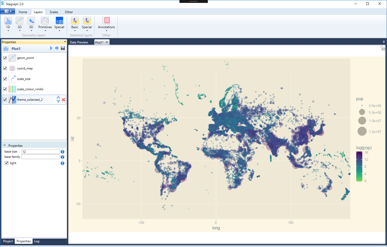
These geometries come from external packages such as ggalt or ggforce. Using these packages, you can create additional types of graphs such as mosaic plots, treemaps, horizon plots or joyplots. Along with these geometric layers, new statistical layers also come. The statistical layers were divided into two groups: basic - they come from the basic ggplot2 package and special - from external packages. In addition, Stagraph 2.0 introduces annotation layers. Here you can find functions for plots annotating, such as a North arrow or a scale-bar.
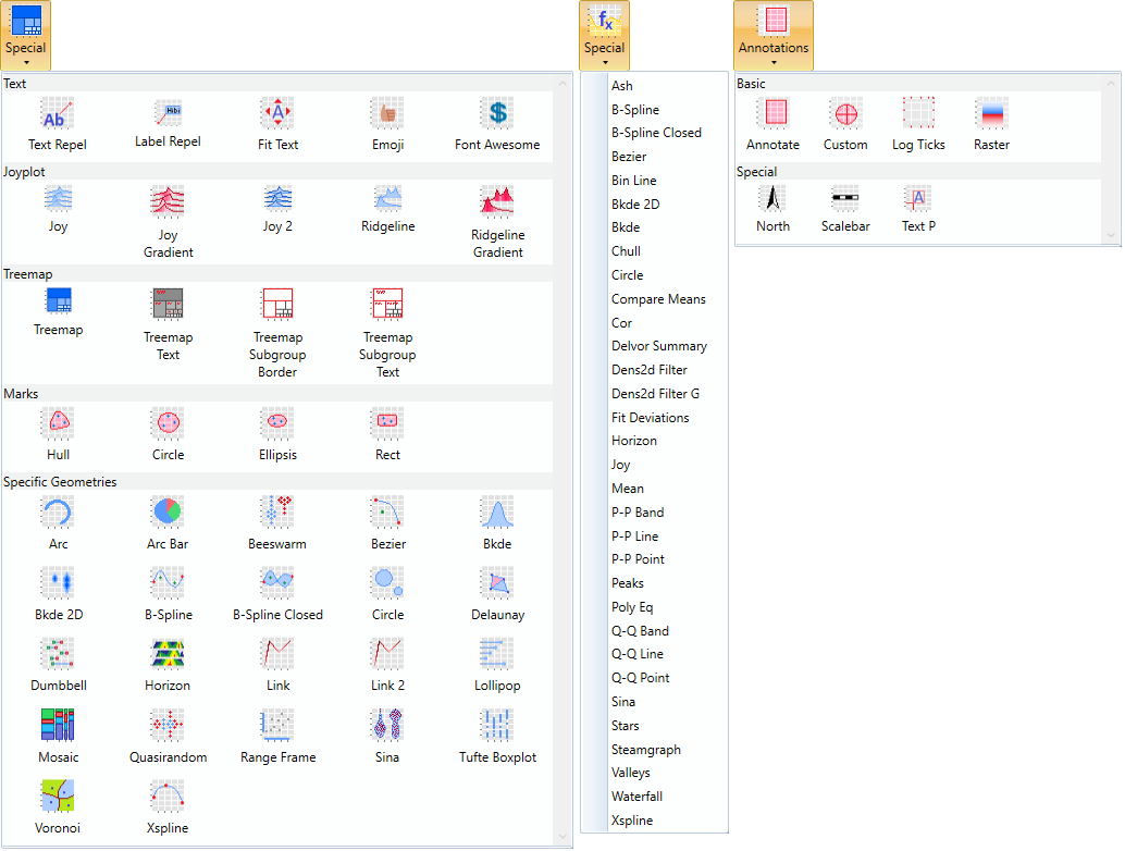
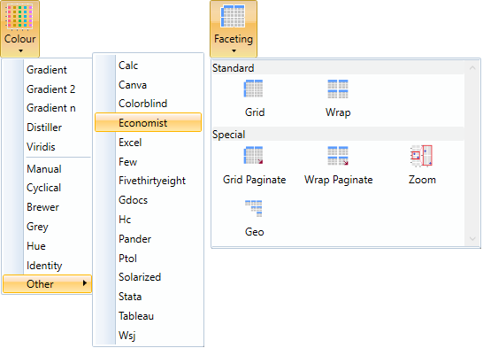
Functions of the Scales group have also been updated. New scales such as viridis color / fill scale or new categorical scales have been added. New functions are available under the ribbon toolbar tab Other, where you will find new options for plot faceting and themes.
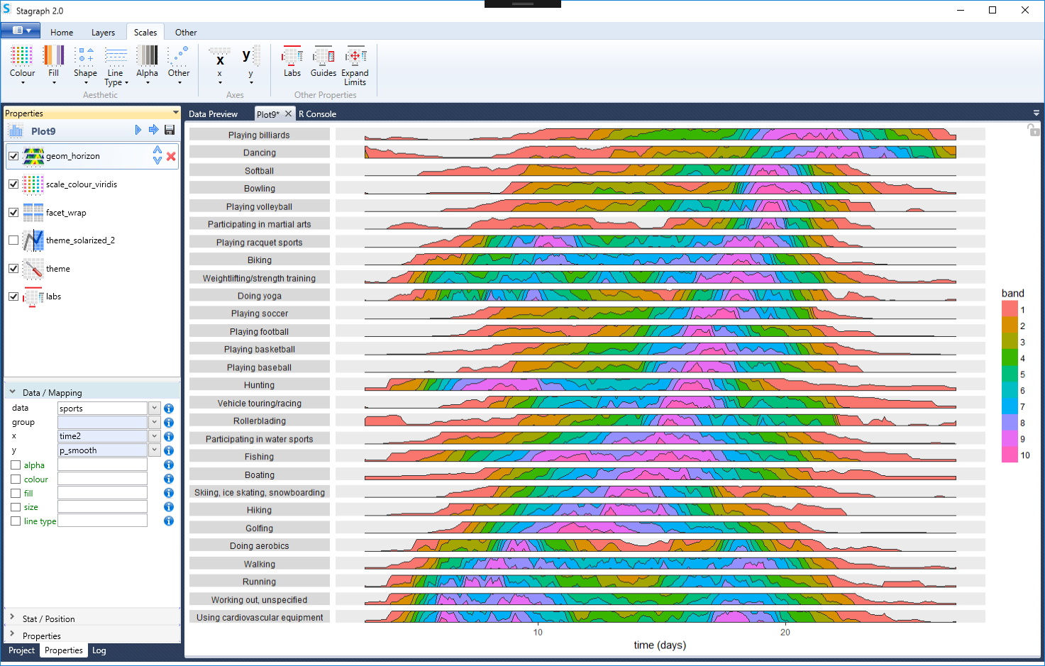
An example of a new geometric layer you can use in Stagraph 2.0 is geom_horizon. Using this geometry, you can create impressive data visualizations based on the horizon plot.
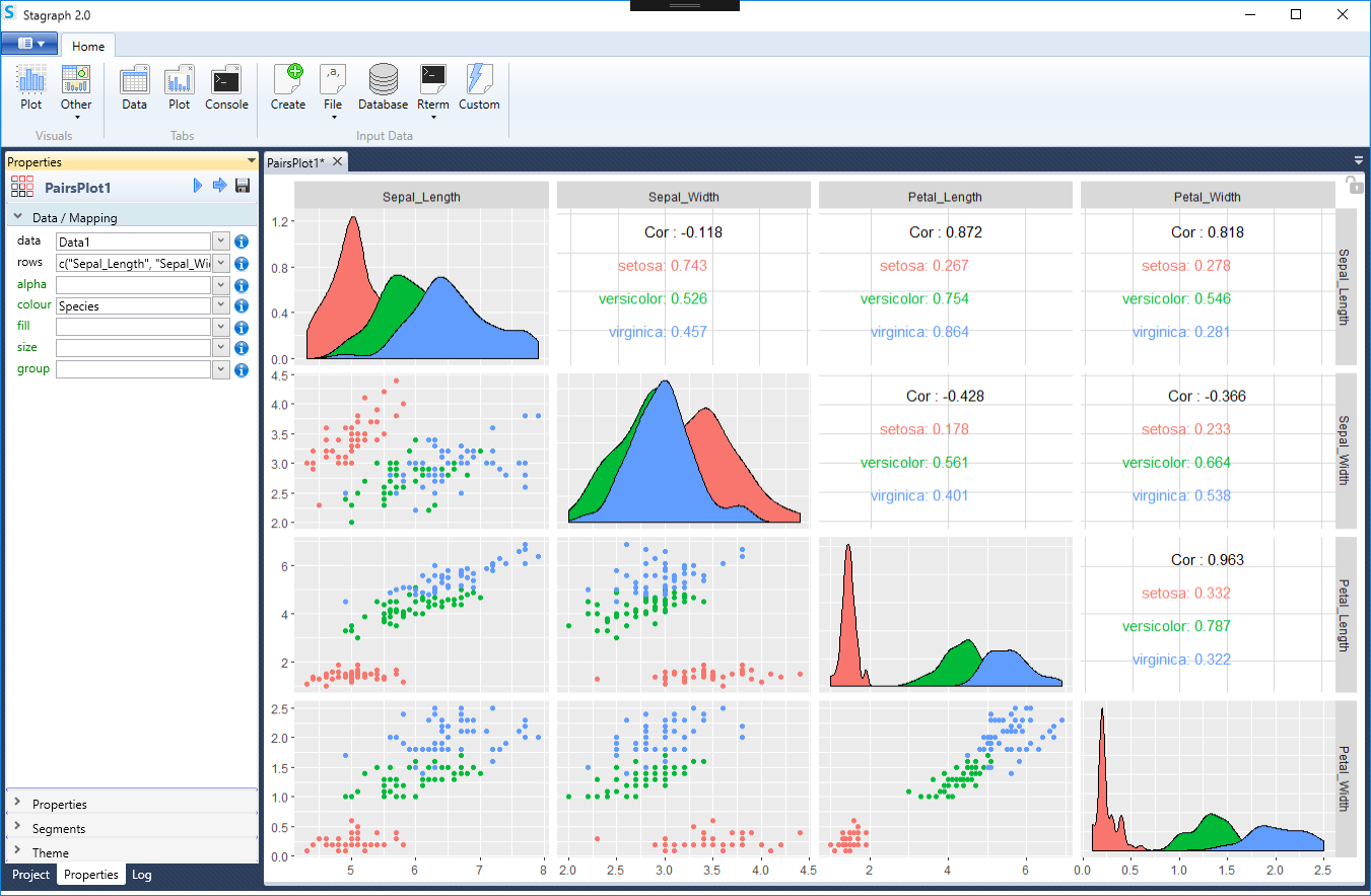
From other visuals we can describe, for example, a pairs plot. This object serves to create pairs plots, which contains the same options of definition and adjustments as the basic plot. Their purpose is to compare multiple variables of one dataset.
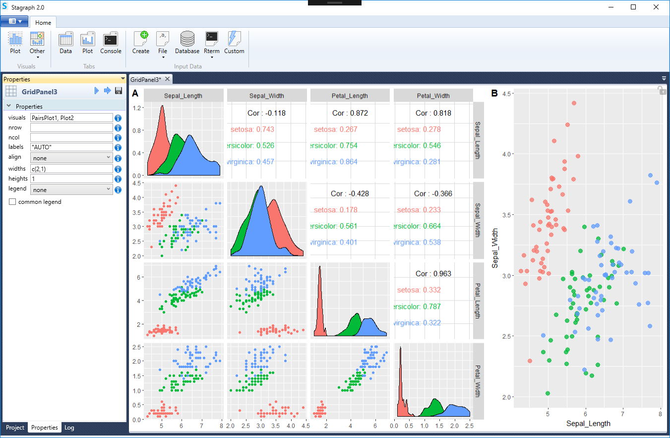
Well, in the end, all visuals (listed in the Project panel) can be combined together to create data visualizations that are composed of several plots. A simple example is shown in the following illustration. The final visualization consist of two objects - pairs plot (left) and simple plot (right).
There is more and more novelties, changes and updates in Stagraph 2.0 and it will be described in the following posts. As an example, the possibility of exporting and publishing the plot into online vector form using the plotly.js package can be mentioned. This library also allows you to create animated plots.
The latest important innovation is the change in licensing options. From version 2.0, the program will be released in a different form. Previous versions allow you to use (as a Demo) all the functions, but only with a limited amount of data (max 200 records / rows of the dataset). From 2.0 version, the program will be released under the freemium licensing model. Under this model, you will not be limited by the amount of input data you can use. Also, the data wrangling options - functions from the Data ribbon toolbar tab - are absolutely not limited. The only feature that will be limited (in the free version) is the type of available geometric layers. Only some basic geometries will be available in the free version, such as geom_point, geom_bar, geom_col, geom_text, geom_line and geom_path. Others will be available only in the Professional version.