 geom_col
Bar chart. geom_col makes the height of the bar from the values in dataset.
Aesthetics
Other Properties
| width |
bar width. By default, set to 90% of the resolution of the data |
Similar Geometries
geom_bar,
geom_histogram
Description and Details
Using the described geometry, you can insert a simple geometric
object into your data visualization – bar layer that is defined by two positional aesthetic properties (x and y).
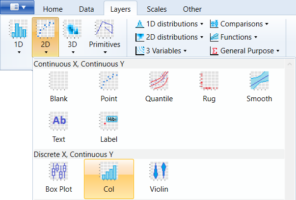
You can find this geometry in the ribbon toolbar
tab Layers, under the 2D button.
Basically, geom_col is a wrapper over the geom_bar geometry,
which has statically defined the statistical transformation
to identity. This means that the values for positional parameters
x and y are mapped directly to variables from the selected
dataset. Thus, the geom_col at position x draws the bar to the
coordinate defined by the variable y. If x has multiple values,
these are stacked (position property = stack).
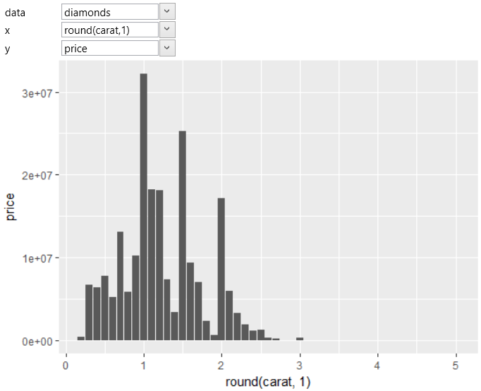
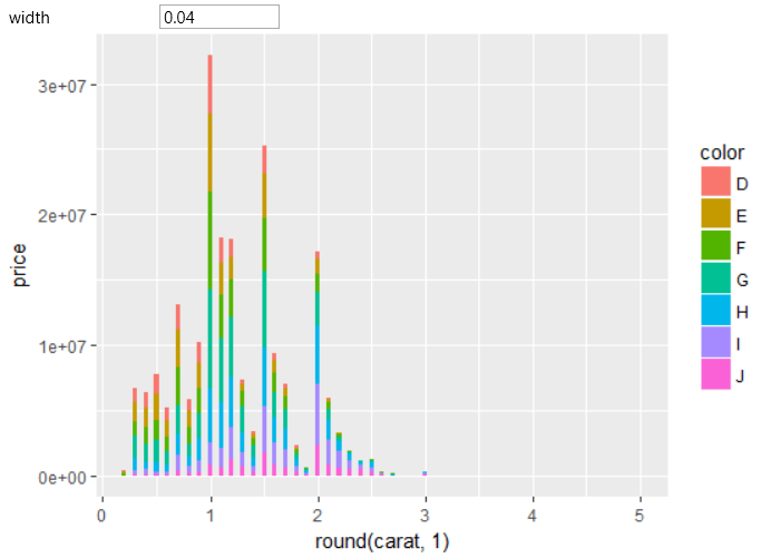
An example of use is the following figure. On the X axis, we mapped
the carat values from the diamond database. These values were rounded
to one decimal place (using R function round). On the Y axis we
mapped the price of diamonds. Since there are several diamonds in the
database for each carat value, the prices are summed up. As a result,
we have the display of total diamonds price at a given carat value.
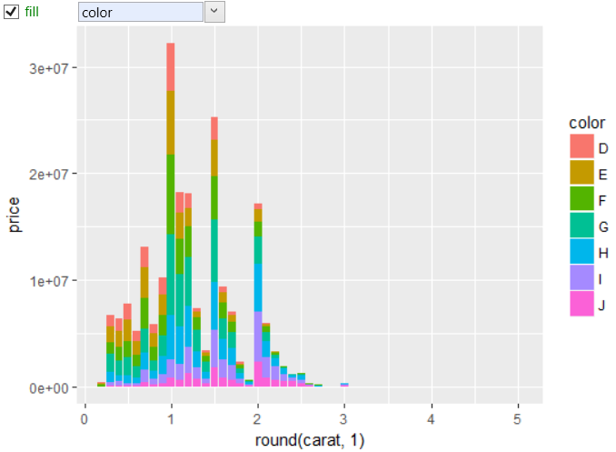
Subsequently, we can look at the price in more detail and divide the
records using aesthetic property fill to grouping the diamonds
according to their color. The example is shown in the
following figure.
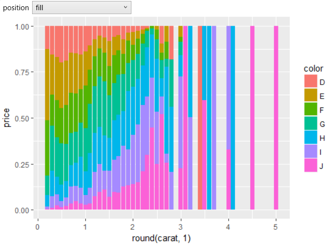
We get a slightly different view if we change the position parameter
from stack to fill. In this case, we will see a standardized unit
display.
Similarly to geom_bar, presented geometry contains in the
Properties Section one auxiliary argument – width. Using this
parameter, you can change the width of displayed columns. By
default, columns fill the entire unit space. In the following
example, we have significantly reduced this width.
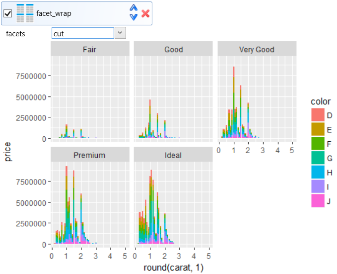
If you want to divide the data visualization by another variable
from the dataset, you can use the facet_wrap object. In the
following example, we've partitioned one graph into multiple
subplots using the cut variable. As a result, we show the sum
of diamonds prices in relation to carat values, dividing these
diamonds into groups, according to diamonds color and
quality (cut).
With this combination of multiple geometries and objects, you
can efficiently and quickly Plot important factors and
phenomenon that are present (and / or hidden) in your data.