geom_point
Geometry layer geom_point is used to create scatter plot,
which is most useful for display the relationship between
two variables.
Aesthetics
Similar Geometries
geom_count,
geom_bin2d,
geom_hex,
geom_density2d
Description and Details
Using the described geometry, you can insert a geometric object
into your data visualization – point layer that is defined by
two positional aesthetic properties x and y. You can find this
geometry in the ribbon toolbar tab Layers, under the 2D button.
Point geometry is the easiest to understand, the simplest to
setup and most useful. Therefore, its support in also
significant in the Stagraph. This geometry is defined
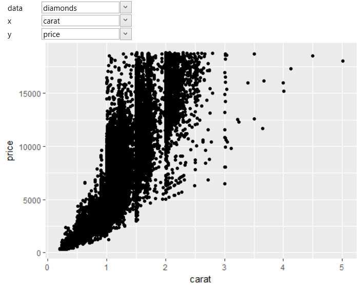
through three properties. Firstly, we must to define
selected dataset (the data property). In the second step,
we map two positional aesthetic properties – x and y. In
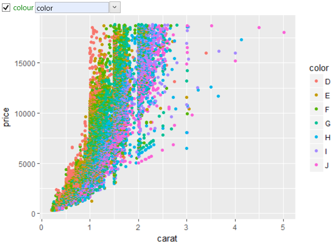
the following examples, we will use built-in diamonds
dataset and on axis we map the carat and price variables.
The result is shown in the following plot.
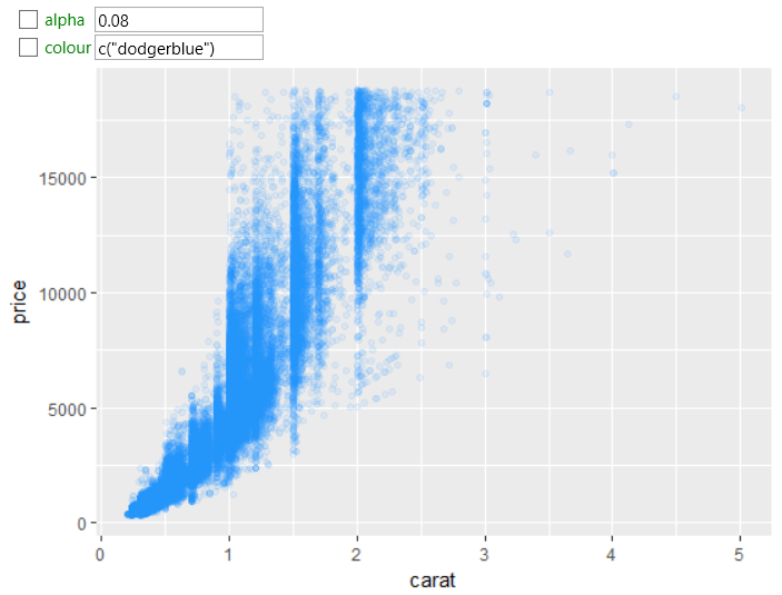
By default, black points are displayed. Visual properties,
we can statically setup or map to selected dataset variables.
In the following chart we set the color of the points to
dodger blue and the transparency (alpha property) was set to 0.08.
In the next step, we mapped the color property of points
to the diamonds color variable. The program automatically
generates categorical color scale and applies it to individual
points in the data visualization. The result is shown in the
following figure.
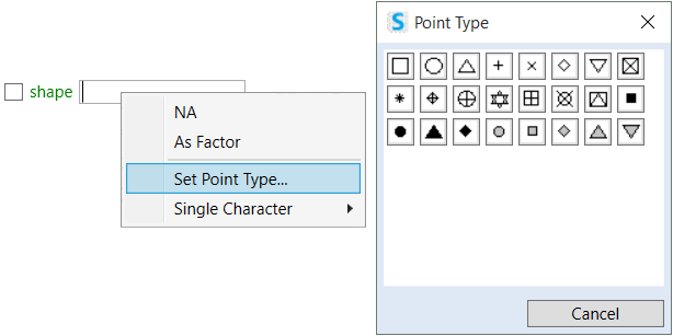
Point geometry includes one important aesthetic parameter –
shape that defines the shape of points. You can set this
property to static value or map it to the selected dataset
variable. If you want to set the point shape, you can use
the features that are hidden in the property context menu.
After click on the Set Point Type… item, you will see a help
dialog, from which you can select the point shape for geometry.
More about setting and mapping of point shapes is in separate chapter.
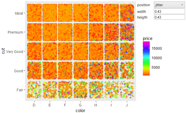
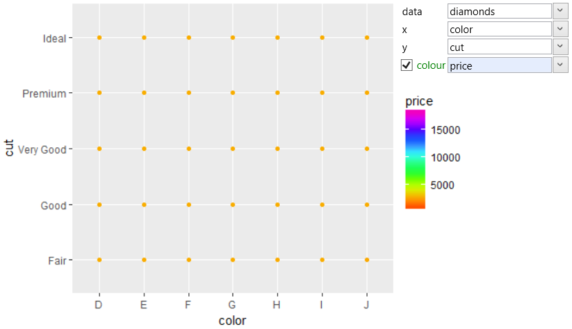
In the next step, we’ll show how to use the geom_point geometry to
Plot categorical values. For this example, we will use also
the diamonds dataset. On the axis we map categorical variables color
and cut. The color property we mapped to the price variable. The
result is shown in the following plot.
In the result is clear high points overplotting and we do
not see the number of points in each category. For better
perception, we can change the position property from default
identity value to jitter. With this setting, a small random
movement will be added to points coordinates, according to
the width and height parameters. The result will be as in
the following figure. From this view, is immediately clear
the quantity of points (especially low) and the variability
of the diamonds price in individual sub-categories.