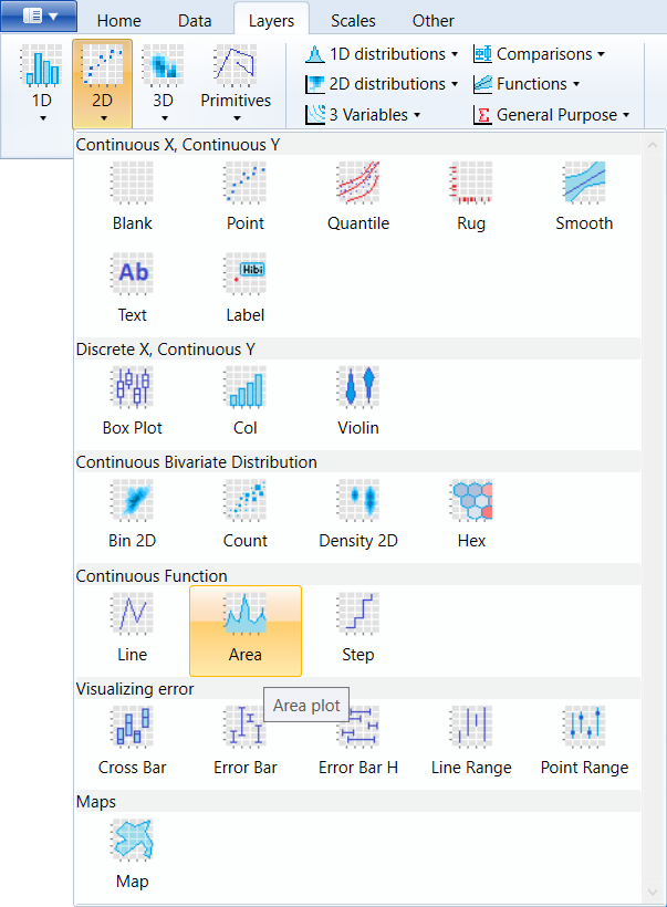
 geom_area
Area plots. Each x value is related with one ymax value and
ymin value is fixed to 0.
Aesthetics
Other Properties
This geometry does not contain other properties.
Similar Geometries
geom_ribbon,
geom_line,
geom_step
Description and Details
Using the described geometry, you can create area geometry
in your data visualization that is defined by two positional aesthetic properties (x and y).
You can find this geometry in the ribbon
toolbar tab Layers, under the 2D button.
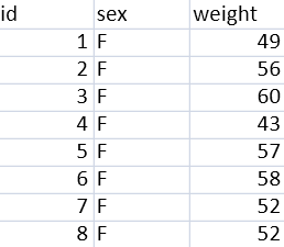
We will use an example based on a dataset that is defined as a
dataset of the weightsof people who are divided by gender An
example of the dataset structure is shown in the following figure.
From this database, we want to see the number of occurrences of
unique weights in the database. For this purpose, we can use
geometric layer geom_area. This geometry required two positional
aesthetic properties x and y. We map the weight variable to X-axis.
On the Y axis, we want to display the occurrence of the weight
values in the database. However, this number we do not have directly
stored in the database. Therefore, we need to adjust the statistical
transformation within geometry. By default, the statistical
transformation in geom_area is set to identity (direct mapping of
variable values from dataset). We change this transformation to count.
In this case, the data will be transformed by counting the occurrence
of unique weight values. Consequently, we can map computed variable
count to y property. We find computed variable in the combo-box under
the name ..count.. The result of this setting is shown in the
following figure.
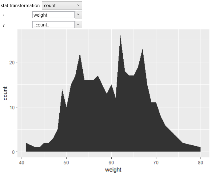
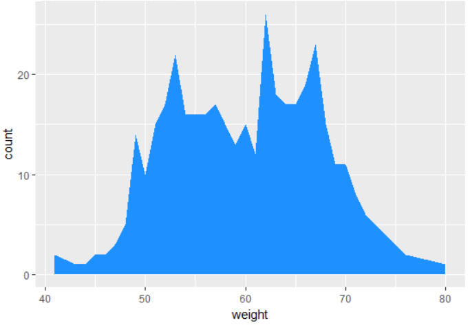
The graph shows the number of unique weights in the dataset. By default,
the area geometry is shown in dark-gray. You can change this color using
the fill property. For example, you can set the fill color to dodger-blue.
Aesthetic property fill you can set or map on the dataset. An example
might be display of the same dataset divided by values of sex variable
into men and women. In this case, you click on the aes check-box and
from the displayed combo-box you choose variable sex. After redrawing,
the values will be divided by the selected categorical variable,
the statistical transformation will be processed individually for men
and women and the result will be Plotd as in the following figure.
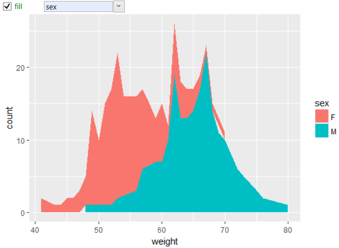
You can change the color scale using objects from the scale_color
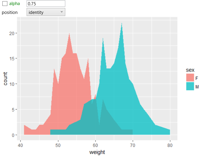
group. By default, the geometric property position is set to stack,
meaning all geometries are loaded “on itself”. In this case, the
results comparison is sometimes complicated. This positional property
you can change. In the following example, we changed the position
to identity and values are displayed on calculated coordinates. For
better readability, we also changed the alpha aesthetic property to
partially transparent (to see the overlapped areas).
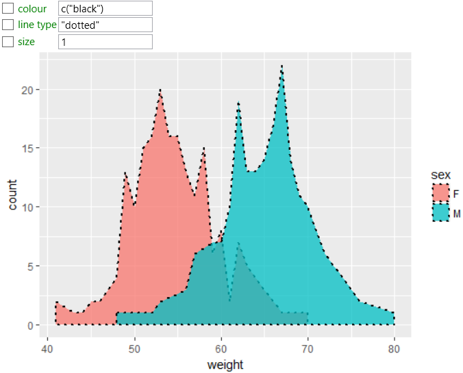
In addition to the background color, it is possible to change the
character and color of the border line. In the following plot, we
set the color of border line to black, line type to dotted and line
thickness to 1.
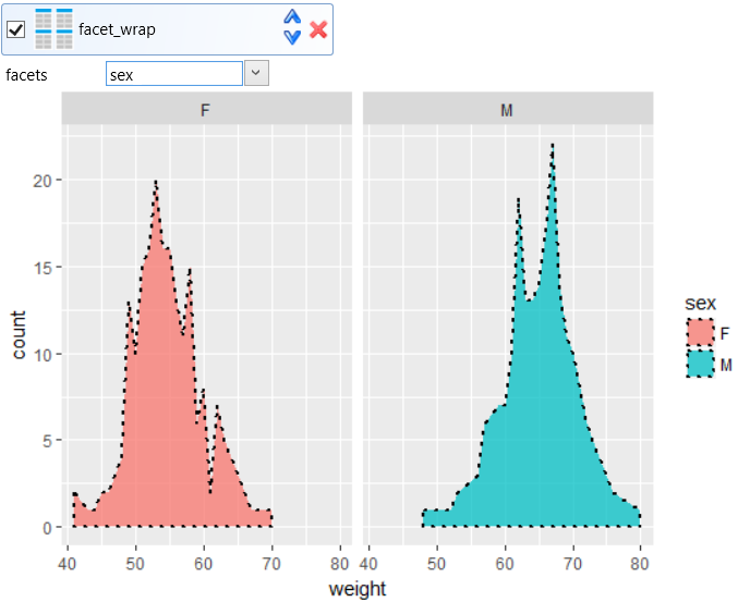
The functionality and usability of each geometry is extensively
expandable by combining them with other optional objects. An
example may be faceting. In the following example, we put a
facet_wrap object into the data visualization, whereby we can
divide the plot into two – displayed values will be divided by
selected variable from used dataset. In the example, faceting
was defined by sex variable. This means that two plots will be
displayed, individually for men and women.
As shown, using a small number of objects (with their properties),
you can display your data in one geometry layer in quite
different ways. Similarly (like geom_area) are also defined
geom_line and geom_step layers. geom_ribbon is subtype of
geom_area geometry, where on Y axis are displayed two values
(ymin and ymax). In the case of geom_area, ymin is automatically
set to zero.