 geom_bar
Bar chart. geom_bar makes the height of the bar proportional to the
number of cases in each group or if the weight aesthetic is supplied,
the sum of the weights.
Aesthetics
Other Properties
| width |
bar width. By default, set to 90% of the resolution of the data |
Similar Geometries
geom_col,
geom_histogram
Computed Variables
| count |
number of points in bin |
| prop |
groupwise proportion |
Description and Details
Using the described geometry, you can insert a simple geometric object
into your data visualization – bar layer that is defined by two positional aesthetic properties (x and y).
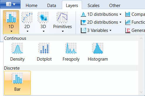
You can find this geometry in the ribbon toolbar tab Layers,
under the 1D button.
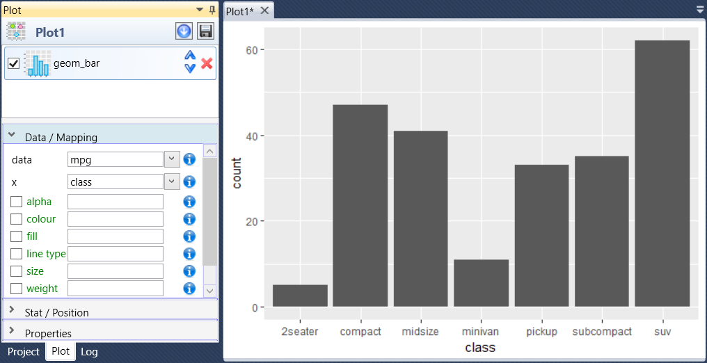
Basically, geom_bar serves to display a number of unique (discrete)
values along the X axis. Therefore, we only define positional
parameter x. On Y axis are mapped computed values (..count..)
if the statistical transformation is set to count. After dataset
selecting and defining the positional property x the barplot is
created, similar to the following figure.
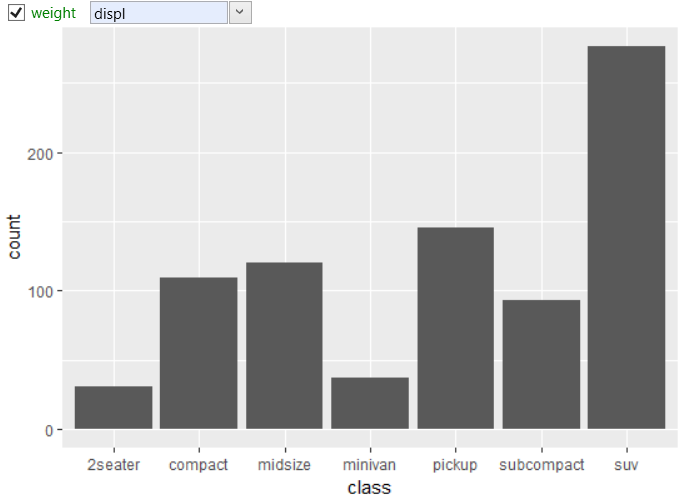
Within the aesthetic parameters, we also find the weight property.
If you want display the sum of values from the selected dataset
variable (on the Y axis), map this variable to the weight property.
The following figure shows an example, where are for each value
from class variable summed the values of displ variable.
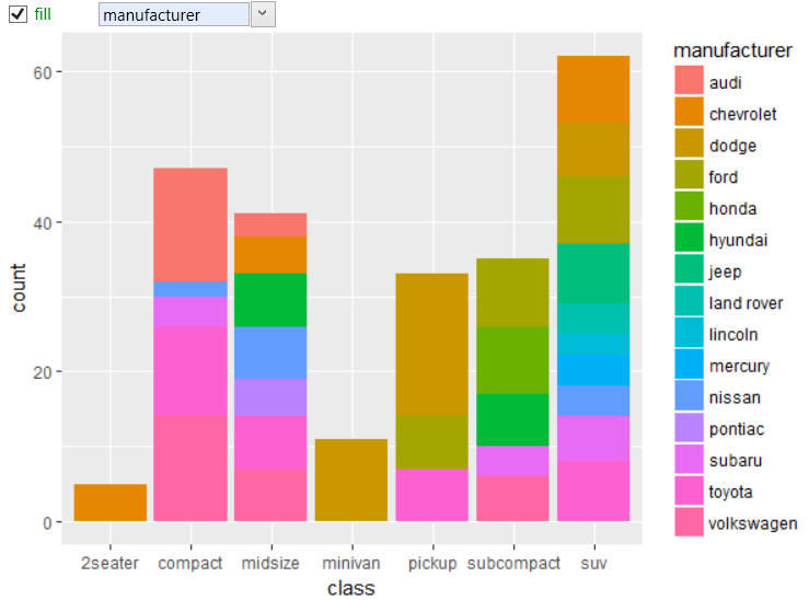
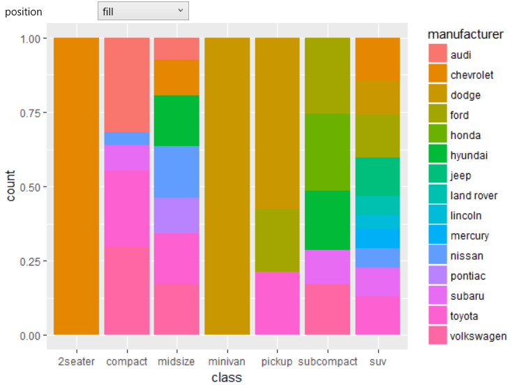
Since the geom_bar has default position property set to stack,
we can divide bars using fill aesthetic by individual manufacturers.
The example is shown in the following figure. In this case, dataset
records are divided by the class variable (X axis) and then are
individually counted records for each manufacturer (fill
aesthetic).
We get another view if we change the position property from stack
to fill. This change standardizes each stack to have unit height.
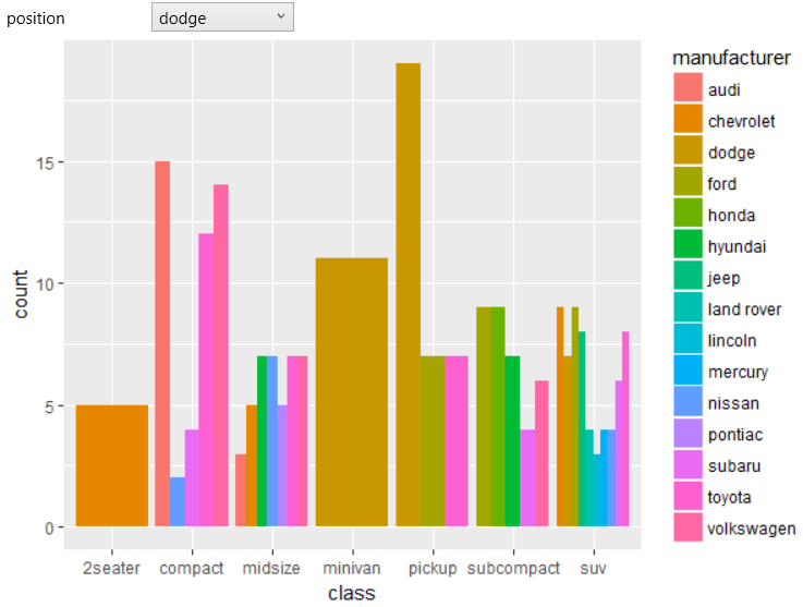
If you change the position to the dodge, the sub-categories
(manufacturer) are shown next to each other.
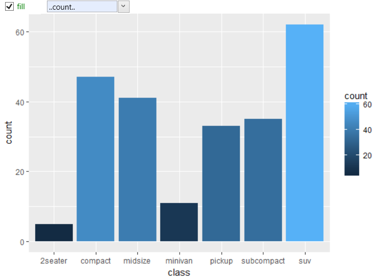
As the statistical transformation of geom_bar geometry is
set to count, we can use Computed variables. In this case,
you can use computed variables ..count.. (number of points
in bin) a ..prop.. (groupwise proportion) already when
defining a graph. The following figure shows an example
where the computed variable was used to define the fill
color of individual bars.
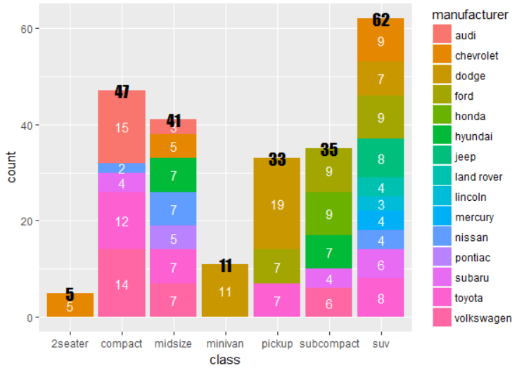
As with other geometries, functionality and usability is a highly
extensible using combination of different geometry types. In the
following example, we used a classic geom_bar display, along with
two geom_text layers. One layer (black color) displays total
number of values in each class category and the second (white)
displays number of values in each (manufacturer) sub-category.
If you want to use bars directly for data mapping (direct definition
of both positional parameters x and y), I recommend to use the
geom_col geometry. Visually very similar (but by definition quite
different) geometry is the geom_histogram.