geom_boxplot
The box plot compactly displays the distribution of a continuous variable.
It Plots five summary statistics (the median, two hinges and two
whiskers), and all "outlying" points individually.
Aesthetics
| x, y |
required position aesthetics |
| lower, upper, middle, ymin, ymax |
alternative position aesthetics (the stat property must be set to identity) |
| alpha,
colour,
fill,
line type,
shape,
group,
size, weight |
classic aesthetics properties |
Other Properties
| width |
bar width. By default, set to 90% of the resolution of the data |
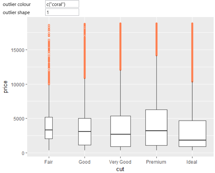
| outlier.colour, outlier.color, outlier.fill, outlier.shape, outlier.size, outlier.stroke, outlier.alpha |
aesthetics for outliers. Set to NULL to inherit from the aesthetics used for the box |
| notch |
if FALSE (default) make a standard box plot. If TRUE, make a notched box plot. Notches are used to compare groups; if the notches of two boxes do not overlap, this suggests that the medians are significantly different. |
| notchwidth |
for a notched box plot, width of the notch relative to the body (default 0.5) |
| varwidth |
if FALSE (default) make a standard box plot. If TRUE, boxes are drawn with widths proportional to the square-roots of the number of observations in the groups (possibly weighted, using the weight aesthetic). |
| coef |
length of the whiskers as multiple of IQR. Defaults to 1.5. |
Computed Variables
| width |
width of box plot |
| ymin |
lower whisker = smallest observation greater than or equal to lower hinge - 1.5 * IQR |
| lower |
lower hinge, 25% quantile |
| notchlower |
lower edge of notch = median - 1.58 * IQR / sqrt(n) |
| middle |
median, 50% quantile |
| notchupper |
upper edge of notch = median + 1.58 * IQR / sqrt(n) |
| upper |
upper hinge, 75% quantile |
| ymax |
upper whisker = largest observation less than or equal to upper hinge + 1.5 * IQR |
Similar Geometries
geom_violin,
geom_bar,
geom_density,
geom_freqpoly,
geom_histogram,
geom_quantile
Description and Details
Using the described geometry, you can insert a box plot geometric objects
into your data visualization, defined by a position aesthetics x and y.
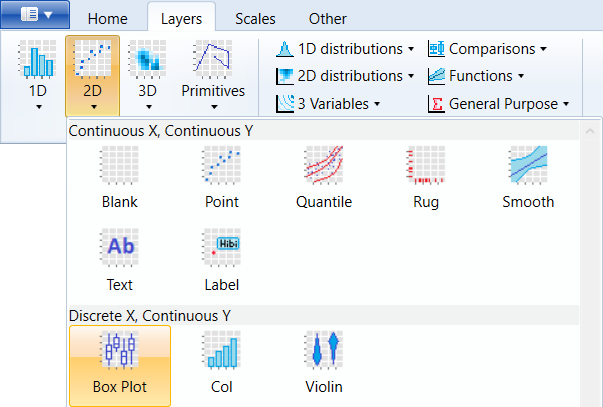
You can find this geometry in the ribbon toolbar tab Layers, under the 2D button.
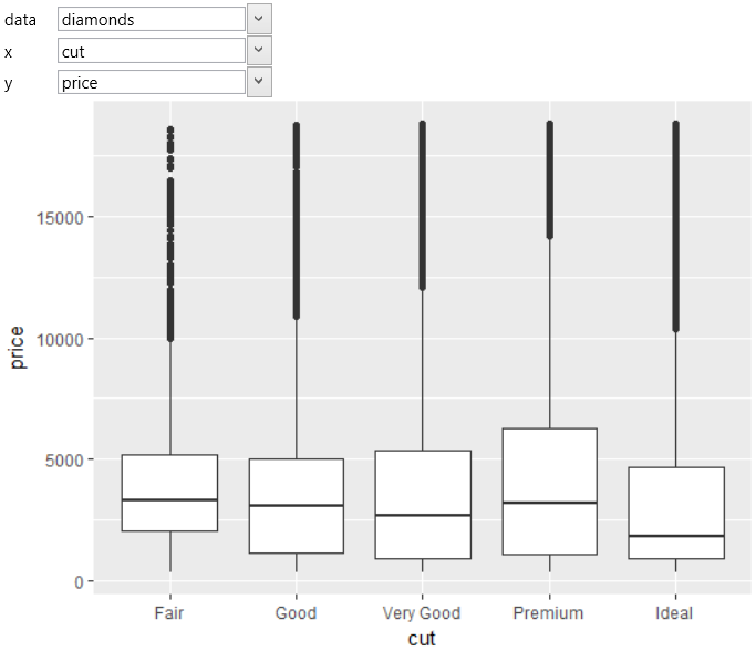
Boxplot is a commonly used data visualization type because it summarizes
multiple statistical parameters at a time. For examples, we use the
built-in diamonds dataset. On the positional aesthetic parameters
(x and y) we map the cut and price variables. The result is shown
in the following figure. On the x axis are displayed individual
diamond quality categories. On the y axis are mapped diamond prices.
The resulting box plots display the statistical values of diamond
prices that were broken down by its quality. Points represents outliers
of prices in each category.
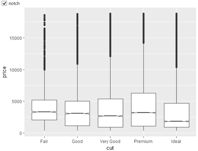
If you want to display notched box plots, just set the notch check-box
to TRUE. The resulted notched boxplot is displayed in the following
figure.
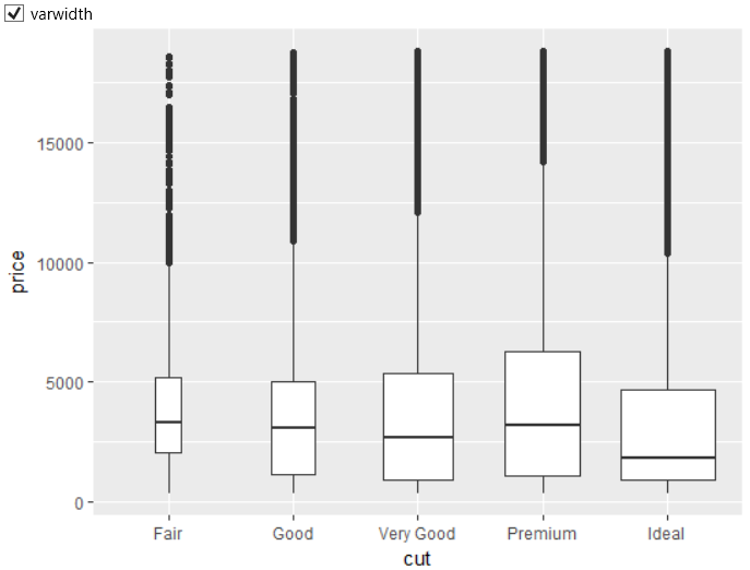
Another check-box varwidth allows drawing box plots widths proportional
to the square-roots of the number of observations in the groups.
An example of an application on our dataset is shown in the
following figure. From the result is clear that diamonds in
the Ideal, Premium and Very Good groups are the
most numerous.
In addition to classical properties and aesthetic parameters, you can
define also the visual properties of points that display outliers.
In the following example, we set the color of these points to Coral
and the point shape to the unfilled circles.