 geom_freqpoly
Plot the distribution of a single continuous variable
by dividing the x axis into bins and counting the number
of observations in each bin. Frequency polygons display the
counts with lines. Frequency polygons are more suitable
when you want to compare the distribution across the levels
of a categorical variable.
Aesthetics
Other Properties
| binwidth |
The width of the bins. Can be specified as a numeric value, or a function that calculates width from x. The default is to use bins that cover the range of the data. You should always override this value, exploring multiple widths to find the best to illustrate the stories in your data. The bin width of a date variable is the number of days in each time; the bin width of a time variable is the number of seconds. |
Computed Variables
| count |
number of points in bin |
| density |
density estimate |
| ncount |
count, scaled to maximum of 1 |
| ndensity |
density estimate, scaled to maximum of 1 |
Similar Geometries
geom_histogram,
geom_line
Description and Details
Using the described geometry, you can insert a simple geometric
object into your data visualization – a frequency line
defined by a position aesthetic property x. You can find
this geometry in the ribbon toolbar tab Layers, under
the 1D button.
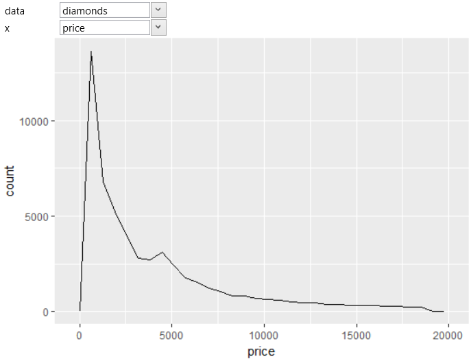
Using the geom_freqpoly geometry, you can display the distribution
of values from one continuous dataset variable. For example, we
use the price variable from the built-in diamonds dataset. The
resulted frequency line is shown in the following plot.
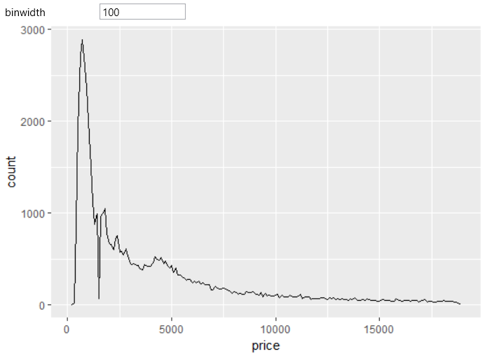
For frequency lines you can define an auxiliary parameter
that has an important influence on the final shape of the
curve. This parameter is named binwidth and defines the
width of bins. binwidth can be defined as a numeric value,
or as a function that calculates width from x aesthetic
property. On the following example, we changed the default
value to 100.
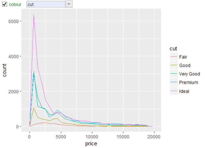
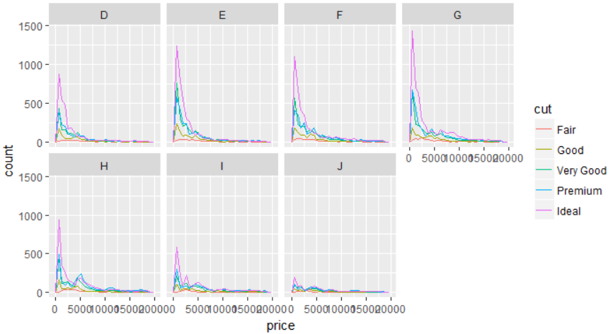
In the case, you can divide your dataset by a categorical
variable into several groups, you can display frequency
lines for each category. The following figure shows an example,
where selected dataset was divided according to the diamonds
quality categories (cut variable). For this purpose, the cut
variable was mapped to color aesthetic property.
For a further dataset categorization, you can use the
facet_wrap object, which allows you to display the lines
for sub-groups of diamonds that are divided not only by
diamonds quality, but also by diamonds color.
In addition to the described geometry, you can also use
the geom_histogram geometry layer to Plot the
distribution of a continuous variable.