 geom_quantile
Geometry fits a quantile regression to the data and draws
the fitted quantiles with lines. This is as a continuous
analogue to geom_boxplot.
Aesthetics
Other Properties
| lineend |
line end style (round, butt, square) |
| linejoin |
line join style – (round, mitre, bevel) |
| linemitre |
line mitre limit (number greater than 1) |
Computed Variables
| quantile |
quantile of distribution |
Similar Geometries
geom_boxplot,
geom_smooth
Description and Details
Using the described geometry, you can insert geometric
objects into your data visualization – layer of quantile
lines that are defined by two positional aesthetic
properties – x and y. You can find this geometry in the
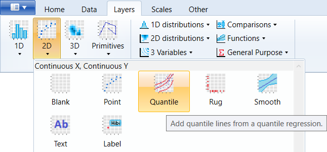
ribbon toolbar tab Layers, under the 2D button.
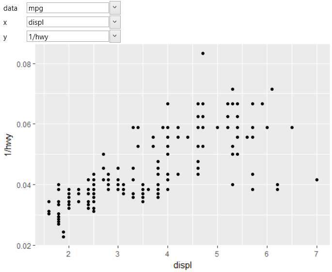
We use the geom_quantile geometry for continuous variables
that are mapped to both axes. In the following example, we
use the built-in mpg dataset and on the axis were mapped
variables displ and 1/hwy. When using point geometry, the
result will look like on the following figure.
If you add the geom_quantile layer to the chart and you
map the positional aesthetics to the same variables, the
result will look like in the following plot.
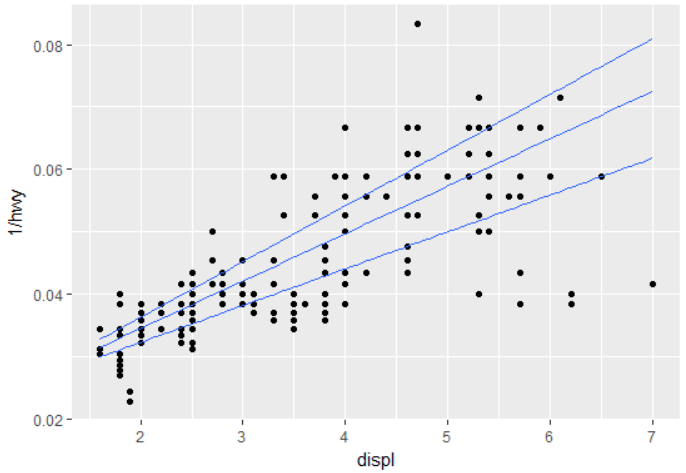
The individual lines represent fitted quantiles at levels
of 0.25, 0.5 and 0.75. These levels are set by default and
are not changeable. If you want to use different levels,
you can do it using the stat_quantile – statistical layer,
which contains more adjustable properties. Statistical layers
are described in the following chapter.