 geom_violin
A violin plot is a compact display of a continuous distribution.
It is a blend of geom_boxplot and geom_density. Violin plot is
a mirrored density plot that is displayed in the same way as a
box plot.
Aesthetics
Other Properties
| draw_quantiles |
If not NULL – default, draw horizontal lines at the given quantiles of the density estimate |
| trim |
If TRUE – default, trim the tails of the violins to the range of the data. If FALSE, don't trim the tails |
| scale |
if "area" - default, all violins have the same area (before trimming the tails). If "count", areas are scaled proportionally to the number of observations. If "width", all violins have the same maximum width. |
Computed Variables
| density |
density estimate |
| scaled |
density estimate, scaled to maximum of 1 |
| count |
density * number of points (probably useless for violin plots) |
| violinwidth |
density scaled for the violin plot, according to area, counts or to a constant maximum width |
| n |
number of points |
| width |
width of violin bounding box |
Similar Geometries
geom_boxplot,
geom_density
Description and Details
Using the described geometry, you can create violin plot that
is defined by two positional aesthetic properties x and y. You
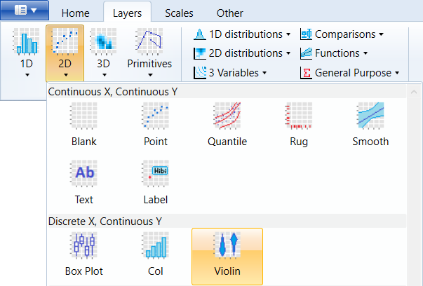
can find this geometry in the ribbon toolbar tab Layers, under
the 2D button.
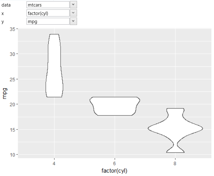
If you want to display geom_violin, you have to map at
least one position property (y) to the selected dataset
variable. If you set the x property to a constant value
(e.g. x = 1), all values of the y variables will be displayed
in one violin. In the following plot, the violin is shown
individually for each categorical value on x axis – factor(cyl).
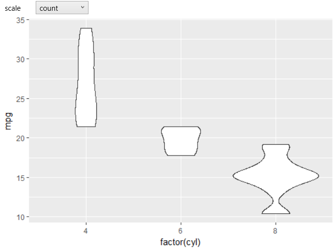
If you want the maximum width of violins to be proportional to
the sample size, you need to set the scale combo-box to count.
In this case, the graph will look like on the following figure.
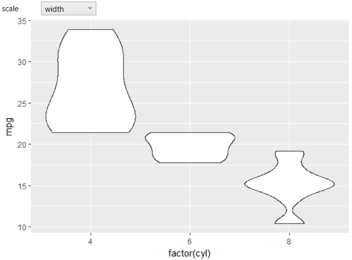
If you want the maximum width of violins to be constant, set
the scale combo-box to width. The result is shown in the
following chart.
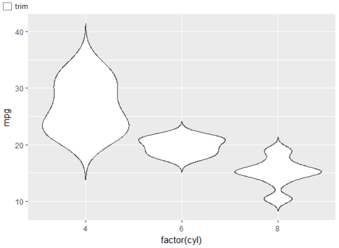
Another adjustable parameter is the trim check-box. If is
set to TRUE (default), trim the tails of violins to the
range of data. If FALSE, don't trim the tails. The example
is in the next chart.
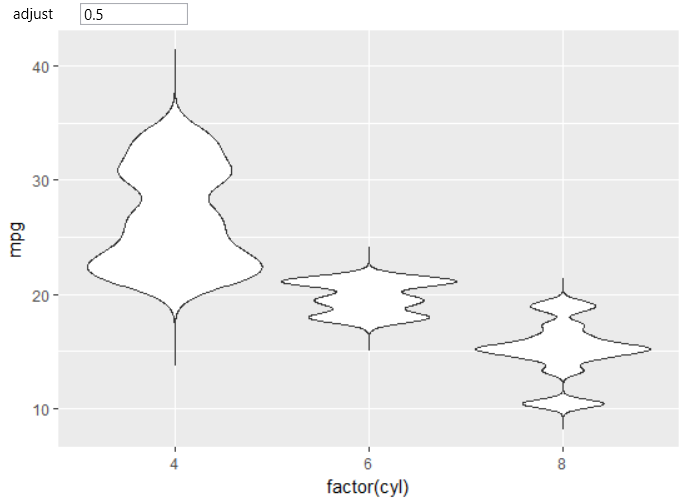
Finally, you can set the adjust property – a multiplicative
bandwidth adjustment. This makes it possible to adjust the
bandwidth while still using the bandwidth estimator. For example,
adjust = 0.5 means use half of the default bandwidth. An
example of this change is shown in the following figure.
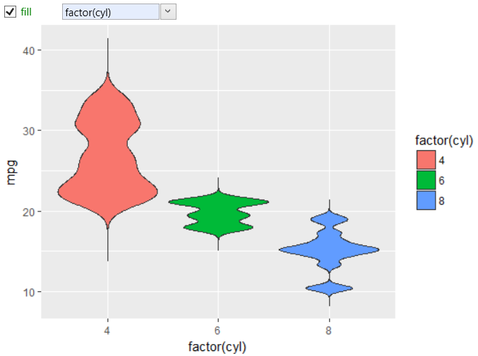
As with other geometries, you can work with classical aesthetic
properties such as alpha, color or fill. In the following
example, we have mapped the fill property to the factor(cyl)
variable.
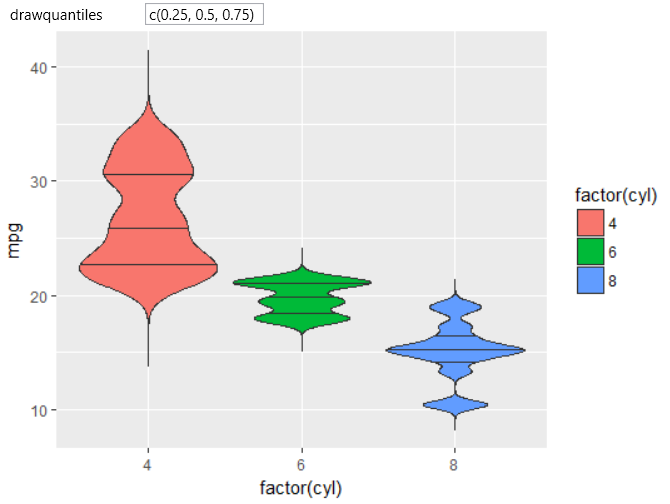
Finally, the last adjustable property remains, under the
name draw.quantiles – which allows you to draw horizontal
lines (inside violins) at given quantiles of the density
estimate. This parameter is defined as a numeric vector.
In the following example, we created the quantile lines
for levels of 0.25, 0.5 and 0.75. The result is displayed
in the following plot.
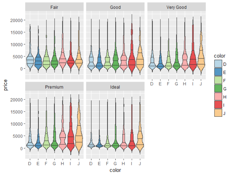
Lastly, we will show a more comprehensive example. In this
case, we used the built-in diamonds dataset. We display a
violin plot for price variable that is on x-axis divided by
the categorical variable of diamonds color. According to
the same variable we have defined the fill aesthetic.
Subsequently, we displayed quantile lines (for levels of
0.25, 0.5 and 0.75) and we've divided the graph into
individual sub-plots using the facet_wrap object that
displays individual plots for diamonds that are divided
by its quality (cut variable).
Other properties and options are available in the case you will
use the stat_violin layer, instead of the geom_violin. The
description of this statistical layer can be found in the next
chapter of statistical layers.