geom_density_2d
Perform a 2D kernel density estimation using kde2d and display the results
with contours. This can be useful for dealing with overplotting. This is
a 2d version of geom_density.
Aesthetics
Other Properties
| contour |
if TRUE, contour the results of the 2d density estimation |
| n |
number of grid points in each direction |
| h |
Bandwidth – vector of length two. If NULL, estimated using bandwidth.nrd |
Computed Variables
Similar Geometries
geom_hex,
geom_bin2d,
geom_count,
geom_contour
Description and Details
Using the described geometry, you can insert a 2D density geometric
object into your data visualization – a contours defined by position
aesthetics x and y. You can find this geometry in the ribbon toolbar
tab Layers, under the 2D button.

Like geom_bin2d and geom_hex, the geom_density_2d layer is also used
to display continuous bivariate distribution. As an example we
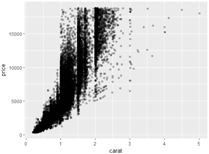
will use diamonds dataset. We map variable carat to the x axis
and price variable to y-axis. If we use geom_point layer, there
is a significant overplotting.
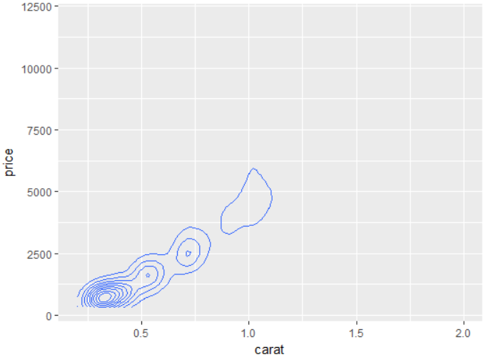
If we want to see the distribution of values in 2d space, you can use the
described geometry. We define it as well as the geom_point geometry
– using positional aesthetic parameters x and y. Subsequently, the
program processes density estimation and the result is displayed
as contour lines.
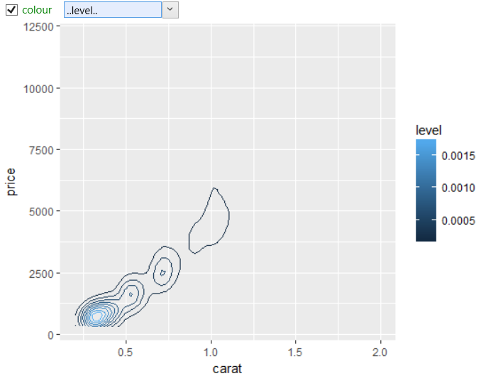
These contour lines display the values from computed variable
named level. Values from this variable you can use for
geometry definition. In the following figure, we used this
variable to map contour lines color. Computed variables
are in aesthetic properties mapped by their names, which
are closed on both sides using two dots.
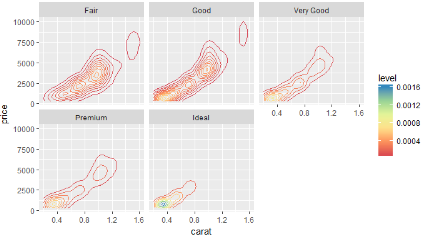
As with other geometries, the usability of geom_density_2d is considerably
expandable when you combine it with other objects. The following
figure shows the 2d density estimation of diamonds, which we modified
(colorfully) using the scale_color_gradient object and plots are
divided in the visualization into a “small multiples” using the
facet_wrap object. As a result, the chart shows the relationship
between the price of diamonds and the value carat and
individual plots are broken down by cut variable, which defines
qualitative categories of diamonds.