 geom_line
geom_line connects the observations in order of the variable on the x axis
Aesthetics
Other Properties
| lineend |
Line end style – round, butt, square |
| linejoin |
Line join style – round, mitre, bevel |
| linemitre |
Line mitre limit – number greater than 1 |
| arrow |
Arrow specification, as created by arrow |
Similar Geometries
geom_path,
geom_step
Description and Details
Using the described geometry, you can insert a simple geometric
object into your data visualization – a line defined by
positional aesthetic properties x and y, where data are
ordered according to variable on x-axis. You can find this
geometry in the ribbon toolbar tab Layers, under the 2D button.
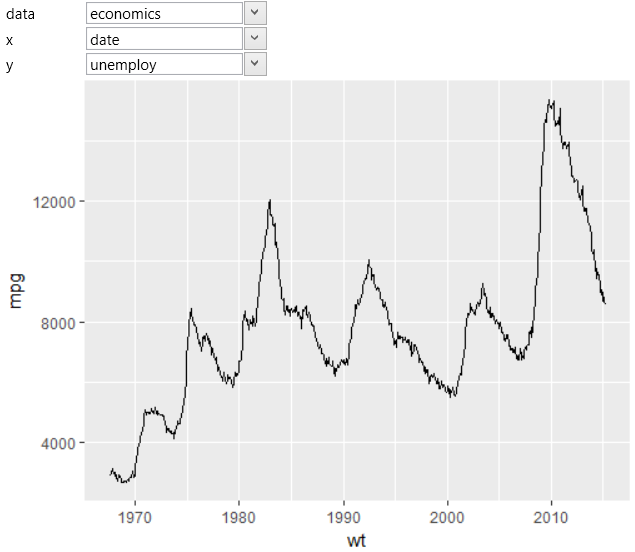
If you Plot temporal data (time-series), they need to be always
ordered according to x-axis, before visualization. For this purpose,
you can use geom_line, which is defined by two positional aesthetic
properties – x and y. The example is shown in the following figure,
where we have displayed the progress of the unemploy variable in time
from the built-in economics dataset.
The structure of dataset in the second example is shown in the
following table. In this case, we have in table three variables.
In table are stored multiple variables that are identified by
variable column. Data in this dataset are stored in the long form
(more about long form here).
| date |
value01 |
variable |
| 1.1.2016 |
0.52 |
pce |
| 2.1.2016 |
0.45 |
pce |
| 1.1.2016 |
0.75 |
pop |
| 2.1.2016 |
0.74 |
pop |
| 3.1.2016 |
0.95 |
pop |
| ... |
... |
... |
If you want to use them, you map selected variables to positional
aesthetics as in the following figure.
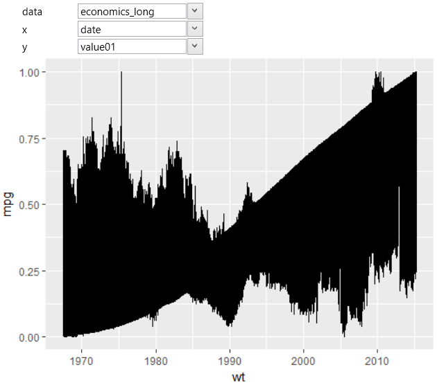
All values were rendered as one geometric object (line).
Program did not know how to divide these values into separate
lines so that the program draws them using one line. If you
want to divide them, you are using another aesthetic property
that will be mapped to selected categorical dataset variable.
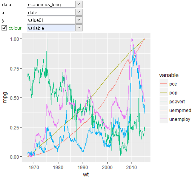
If you want all lines to have the same visual character (e.g.
color), map this categorical variable to the group aesthetic.
In the following example, we have divided them using the color
aesthetic property. The program subsequently split the data
by the selected variable and renders them as separate lines
with different color. The result is shown in the following
visualization.
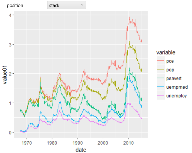
In the following example, we'll use the same data, but the result
will be different. The only parameter we change is the position
property. From the default (identity) value we set it to stack.
According to this setting will be lines stacked each other. The
result is displayed in the following plot.
If you use the geom_line, you can define the color aes only
for the entire line. If you want to define the color for the
individual line segments, use more appropriate geometry –
geom_path, which is defined in the same way.